Spotify Match
Case Study — Product Feature Design
Role
UX Designer
UI Designer
Branding
Duration
Feb - Mar ‘21
2 weeks
Tools
Figma
Overview
Spotify’s mission is clear: “to help people listen to whatever music they want, whenever they want, wherever they want—in a completely legal and accessible way.” As a streaming music service, Spotify is the group lead and it wants to stay that way. For this reason, they want to improve engagement and retention in the app. In order to do that, they want to expand and integrate new features that users can interact with.
Goal
Design a new song/artist recognition feature and ensure it is seamlessly incorporated within the Spotify app
New feature logo
Research Goals
01. Analyze music recognition app competitors to understand strengths and weaknesses
02. Find what users look for in music recognition and how (& when) they use it
03. Find pain points of user’s experience using music recognition apps
04. Find pain points on how users discover new music and add into their playlists
05. Discover features that users find helpful
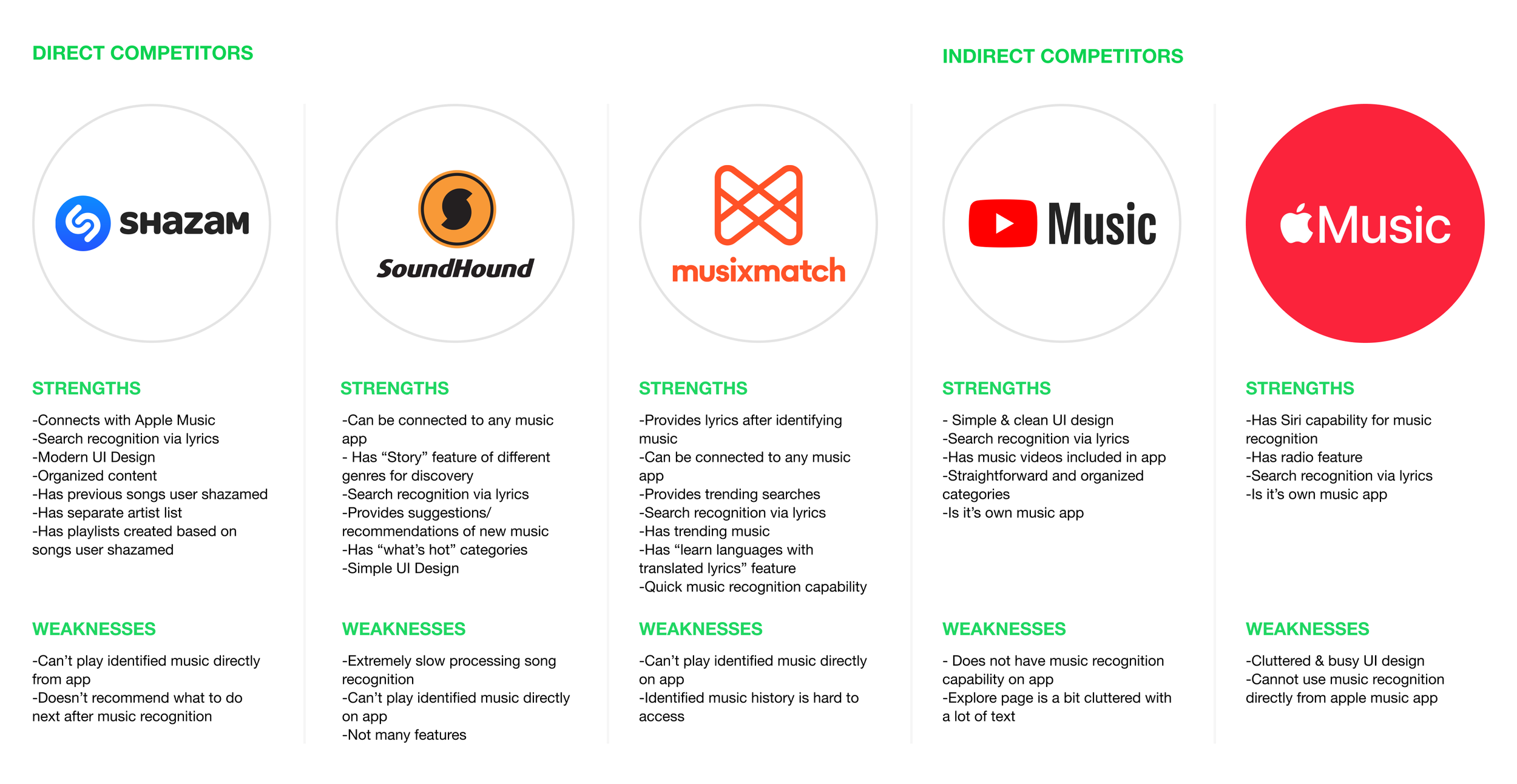
Competitive Analysis
Researched and compared various music recognition apps that were similar to the new Spotify Match feature to gain perspective of the competitive market.
User Interviews
Conducted user interviews to empathize and provide an in-depth understanding of the users’ values, perceptions, and experiences.
Findings
Goals: Users want to identify music quickly and accurately. They also want to find similar songs/artists to their identified songs.
Needs: Users need to be able to include their identified music in curated playlists seamlessly in Spotify.
Frustrations: Most users seem to be frustrated when it takes too long for songs to be identified or when a music detection app is not easily accessible and a song is finished playing.
Motivations: To identify music with lyrics, to find similar artists/music based on their matches, and to have their identified music in playlists.
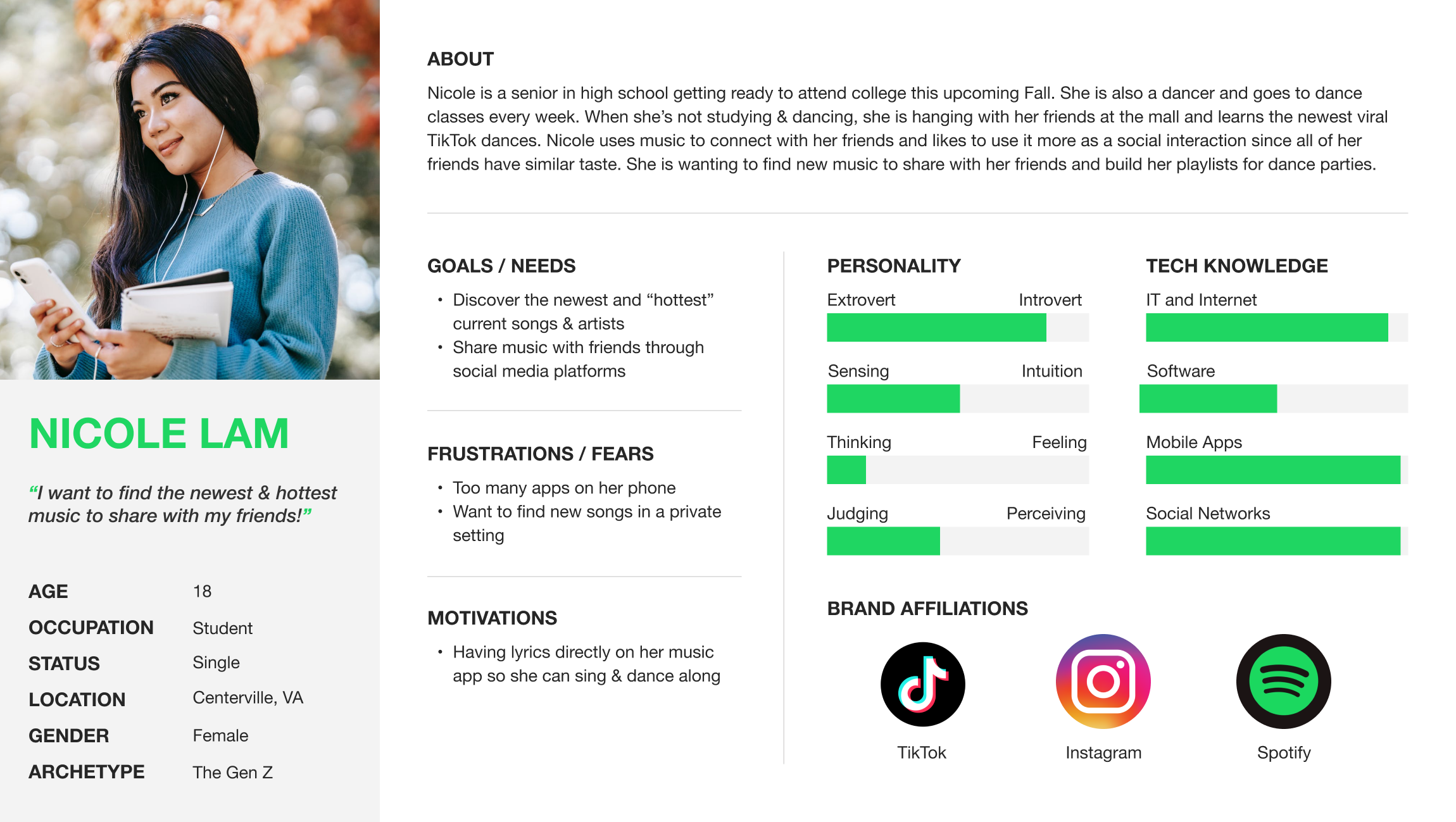
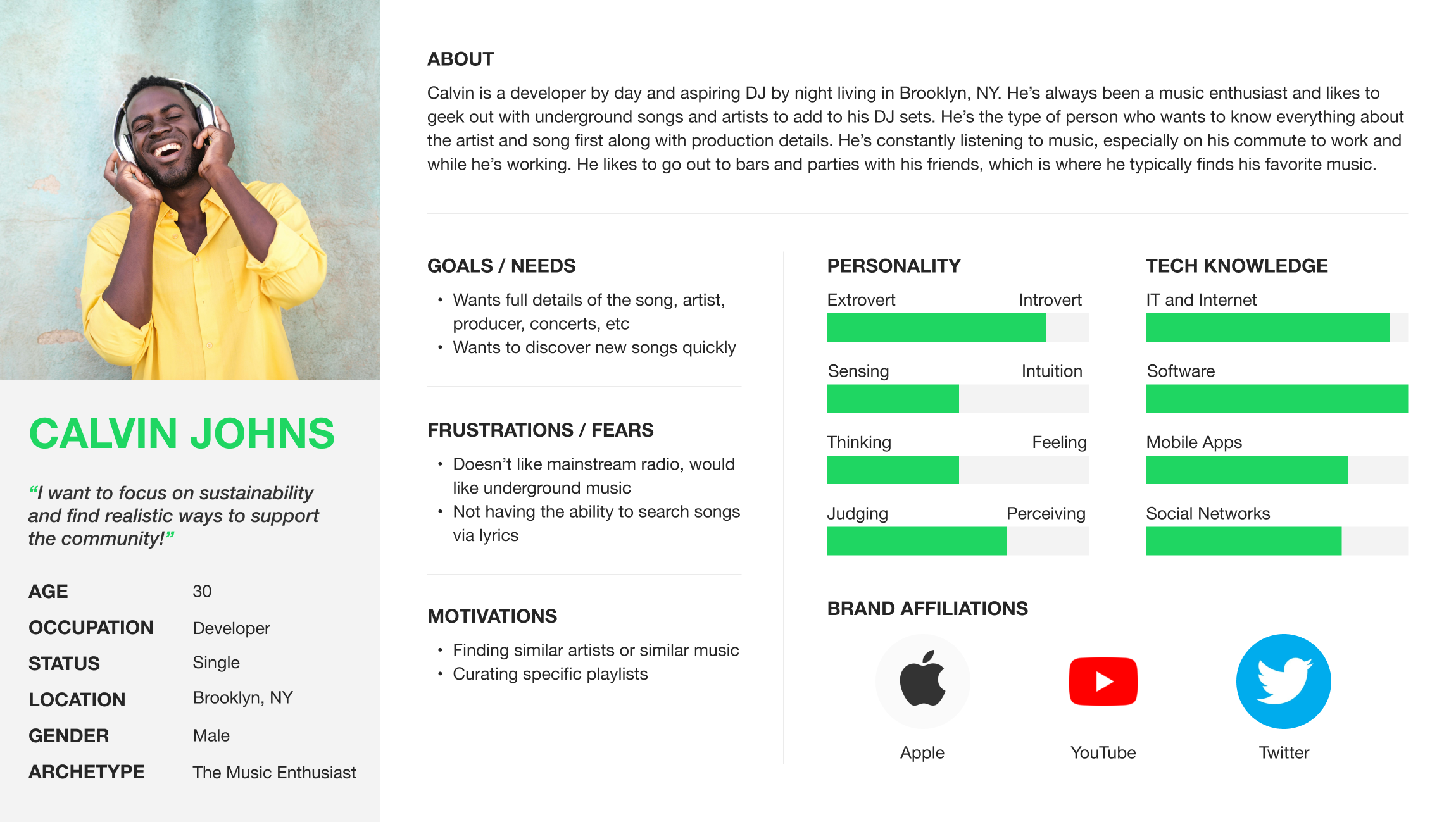
Personas
Based on user interviews and secondary research, personas were created to represent Spotify Match’s target audience. Having personas allowed me to communicate and empathize with the customer’s needs while guiding me with the decision-making throughout the project scope.
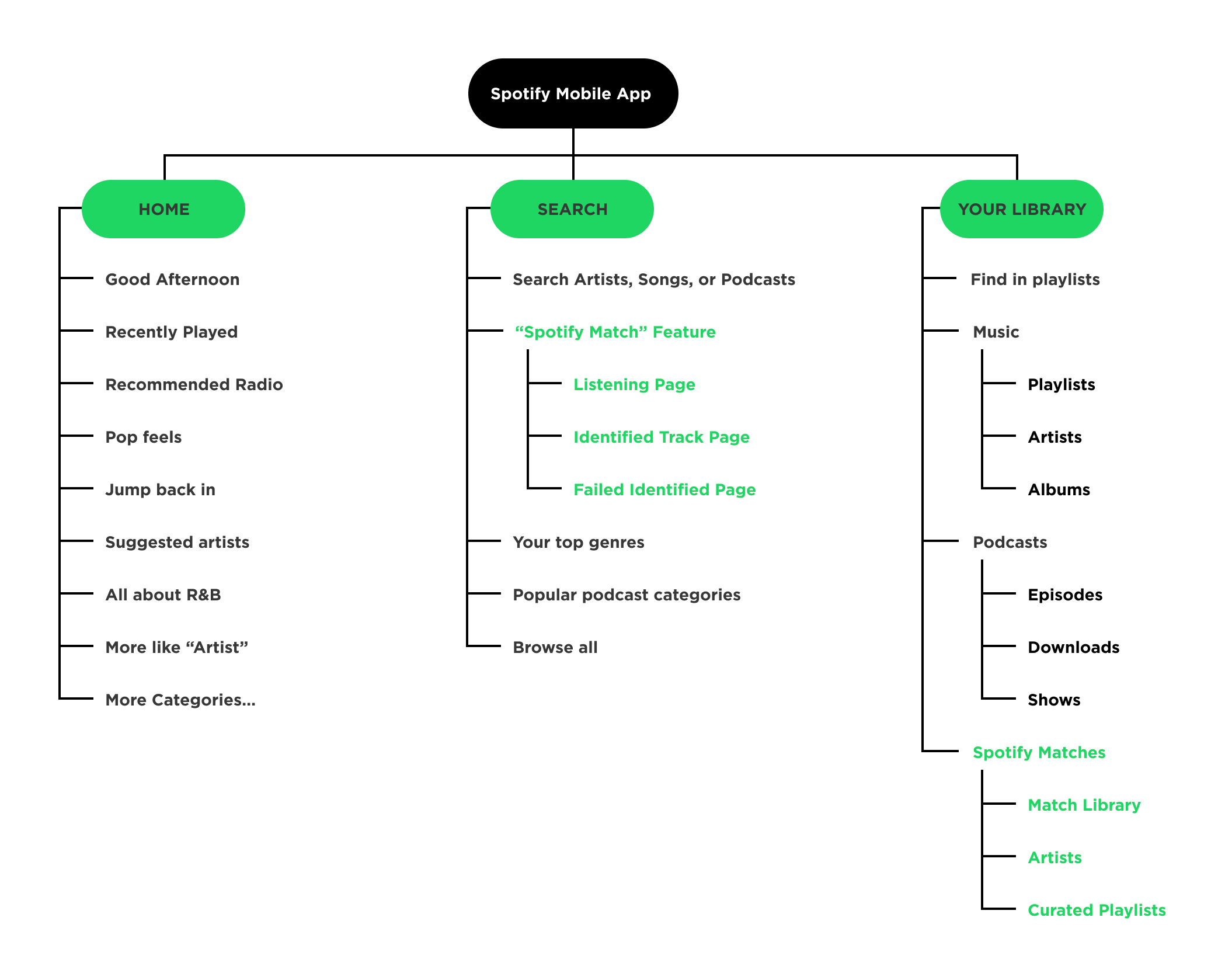
Sitemap
After looking at the competitive analysis and market research, I created a site map of the existing Spotify app to show proposed screen pages while including the new feature.
User Flow
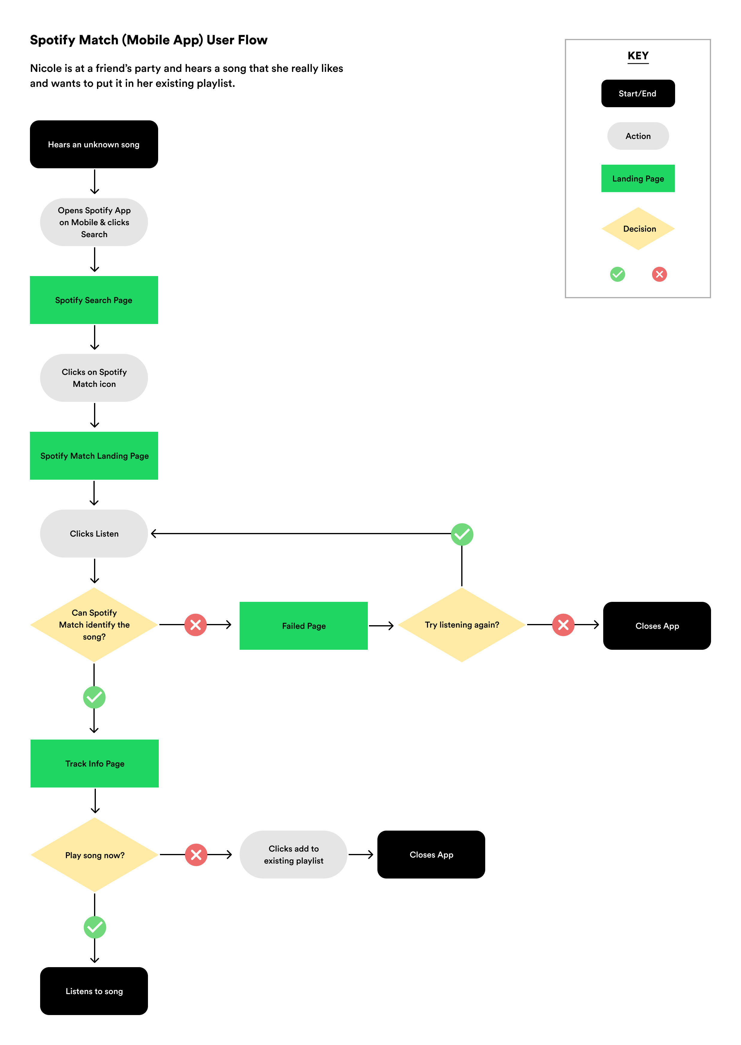
Before designing sketches & hi-fi wireframes, I identified the main flow where the user would complete a task through individual steps.
Design
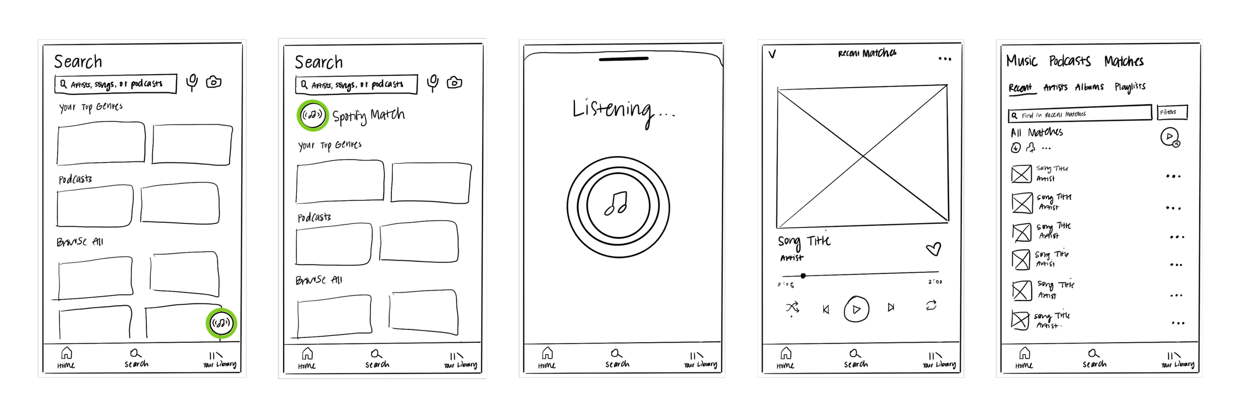
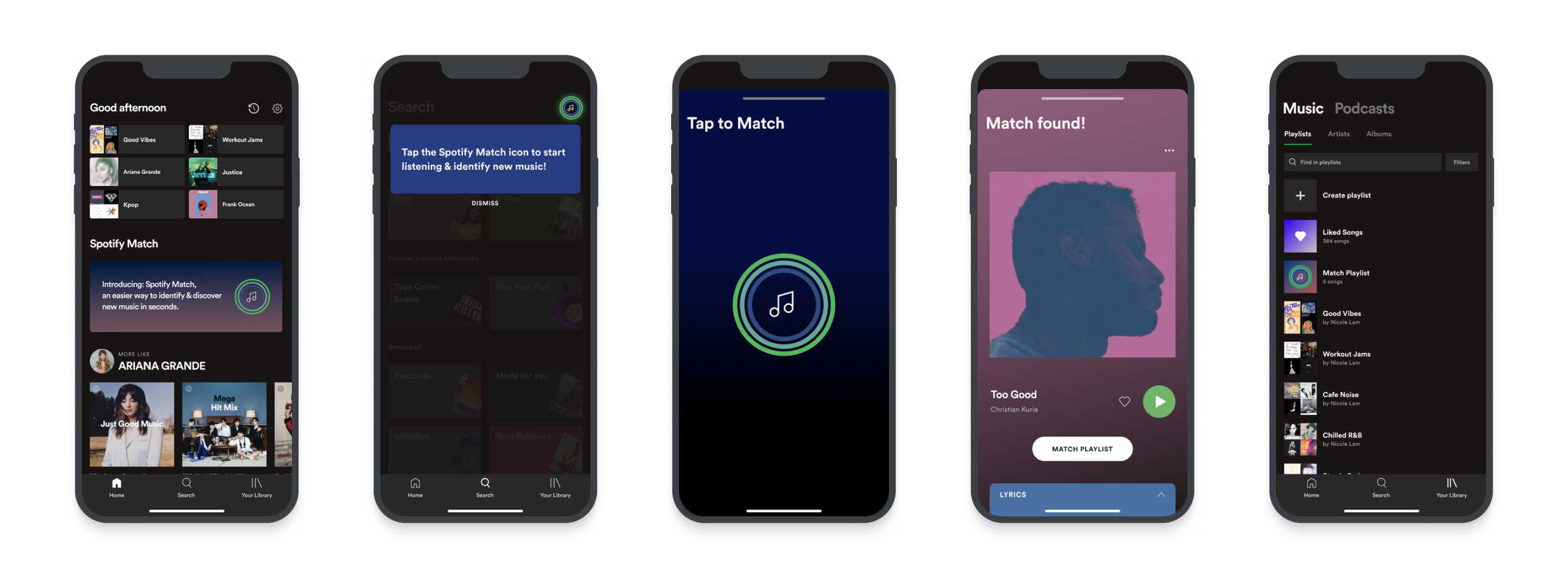
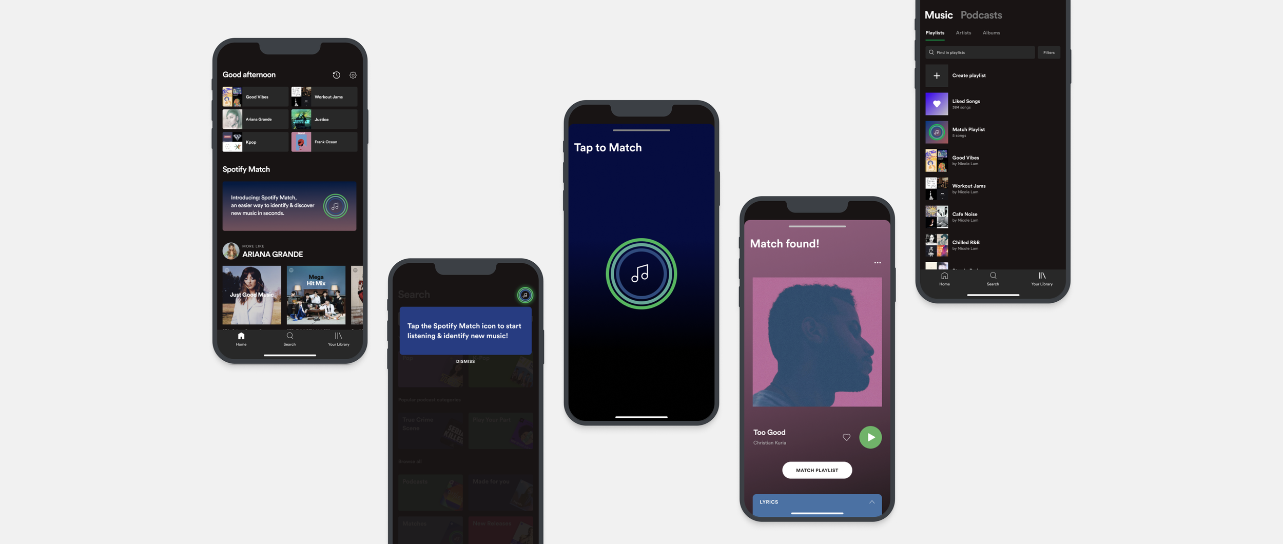
After forming research findings, personas, and IA, I began brainstorming how to integrate the new Spotify Match feature seamlessly within the existing mobile app. This led to creating sketches and the mid-fidelity wireframes for usability testing. Using Spotify’s Design Guidelines, I wanted to incorporate the color palette, flow, and new feature logo to be intuitive and to be respectful to Spotify’s brand restrictions while keeping the familiar user experience.
Sketches
Hi-Fi Wireframes
Usability Testing
Using our mid-fidelity wireframes, I built a prototype for users to participate in usability testing and complete a task based on a specific scenario via Figma.
Overall Findings
All participants found the task to be very easy and were able to complete it successfully
All participants found the new feature to be intuitive and naturally built into the existing app
Participants mentioned they liked the simplicity and clean look of the new feature
Participants liked that they had to physically tap the “Tap to Match” button before beginning to listen to a song since there is less room for error
Participants appreciated that there was a lyrics section in the Match Found page
Improvements
All participants mentioned they expected to see the Spotify Match icon on the Search page next to the search bar
Most participants expected to see all their Matched songs in a playlist under Music in the Library page
Participants expressed they would want to see top songs, similar songs, or similar artists on the Match Found page
Participants wanted more guidance and pop-up windows introducing the new feature and where to find it
Conclusion
Overall, I learned how to effectively create an intuitive and seamless user experience for a product feature as it was my first time creating a new feature within an existing app. Not only was information architecture a key aspect in this project, but I found usability testing to be extremely significant as I received practical and useful feedback from loyal Spotify users.

