Little Red
Case Study — App Design
Role
UX Designer
UI Designer
Branding
Duration
March ‘21
2 weeks
Tools
Figma
Overview
A woman’s cycle is so much more than her period. Every woman experiences different symptoms, mood swings, and energy levels in each cycle phase. Little Red Period Tracker is meant for young women who don’t necessarily need all the bells and whistles but want a simple way to track their periods, set reminders, and purchase period products within one app.
Goal
Design a full end to end mobile app for period tracking & other necessities
Design logo & branding for mobile app
Research Goals
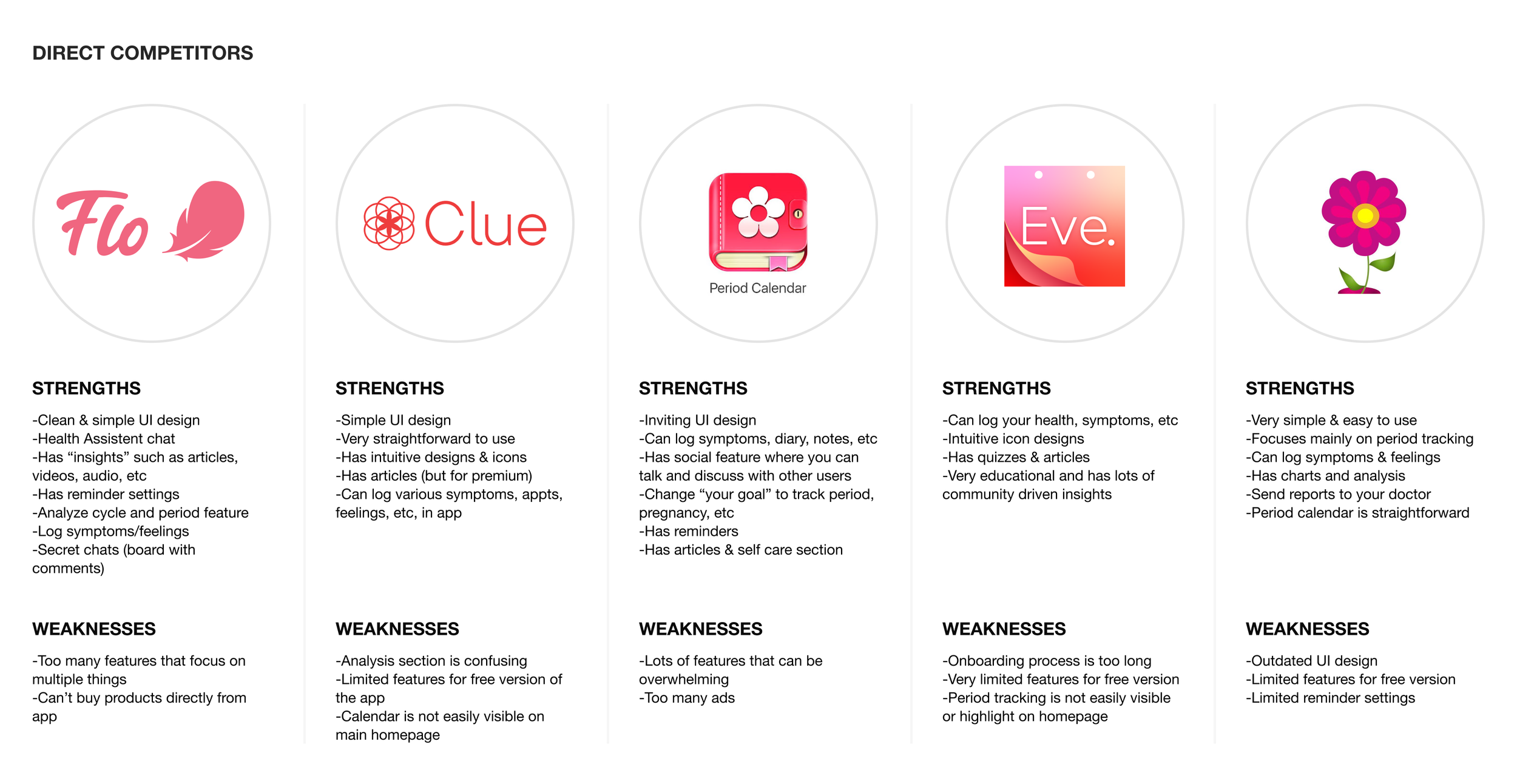
01. Analyze period tracking app competitors to understand strengths and weaknesses
02. Find what users look for in period tracking apps
03. Find pain points of user’s experience using period tracking apps
04. Discover features that users find helpful
Competitive Analysis
Researched and compared period tracking apps along with finding secondary research to gain perspective of the competitive market.
User Interviews
Conducted user interviews to empathize and provide an in-depth understanding of the users’ values, perceptions, and experiences.
Findings
Goals: Users’ goals were to have an app that is simple and easy to understand.
Needs: Users need a straightforward way to track & view their periods while having reminders for their upcoming period.
Frustrations: Users find it frustrating when there is too much information in the app along with period cycle inaccuracy.
Motivations: Users found it would be motivating to use the period tracking app more if they could purchase period necessities and products directly in the app like a “one-stop shop.”
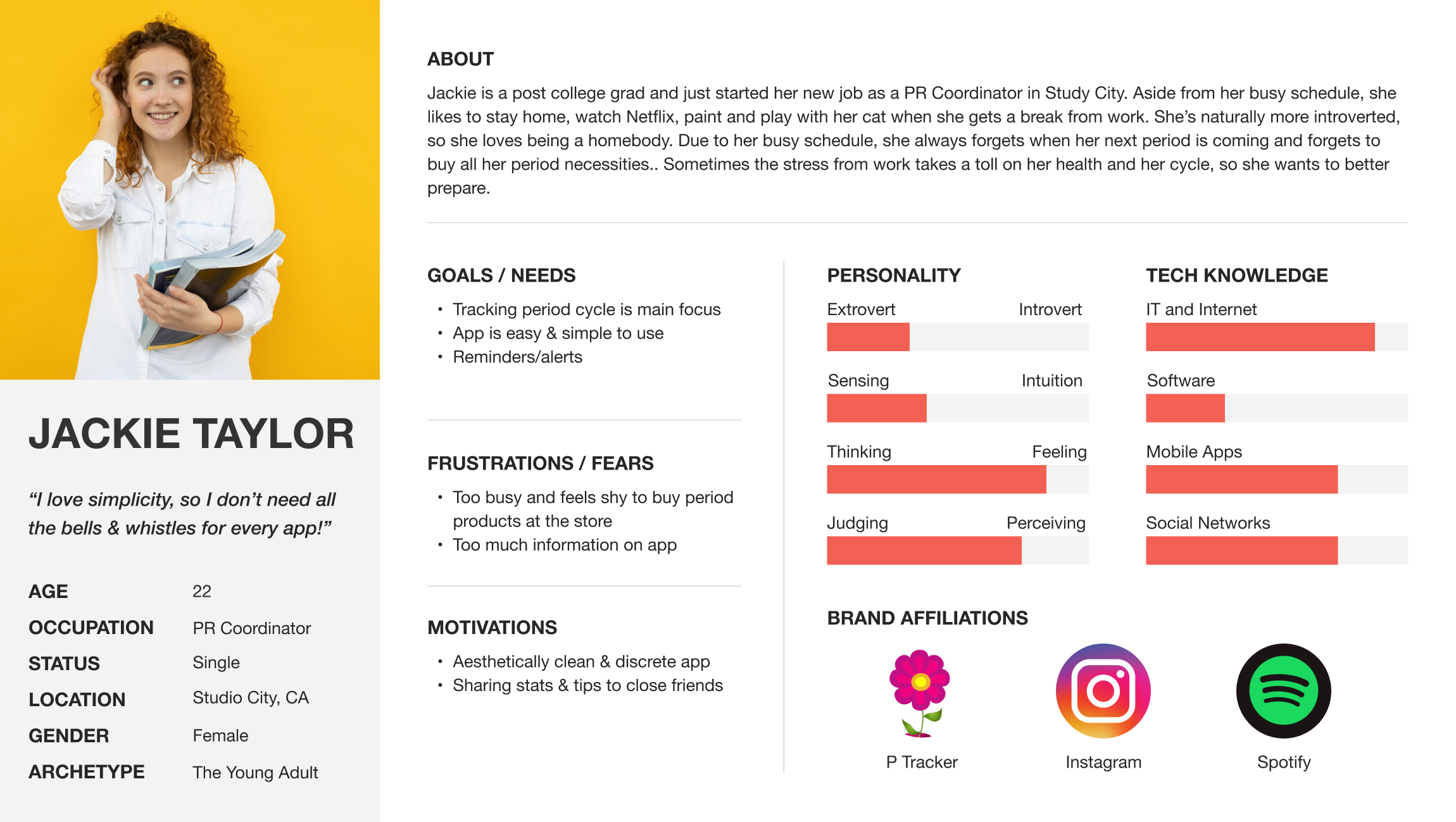
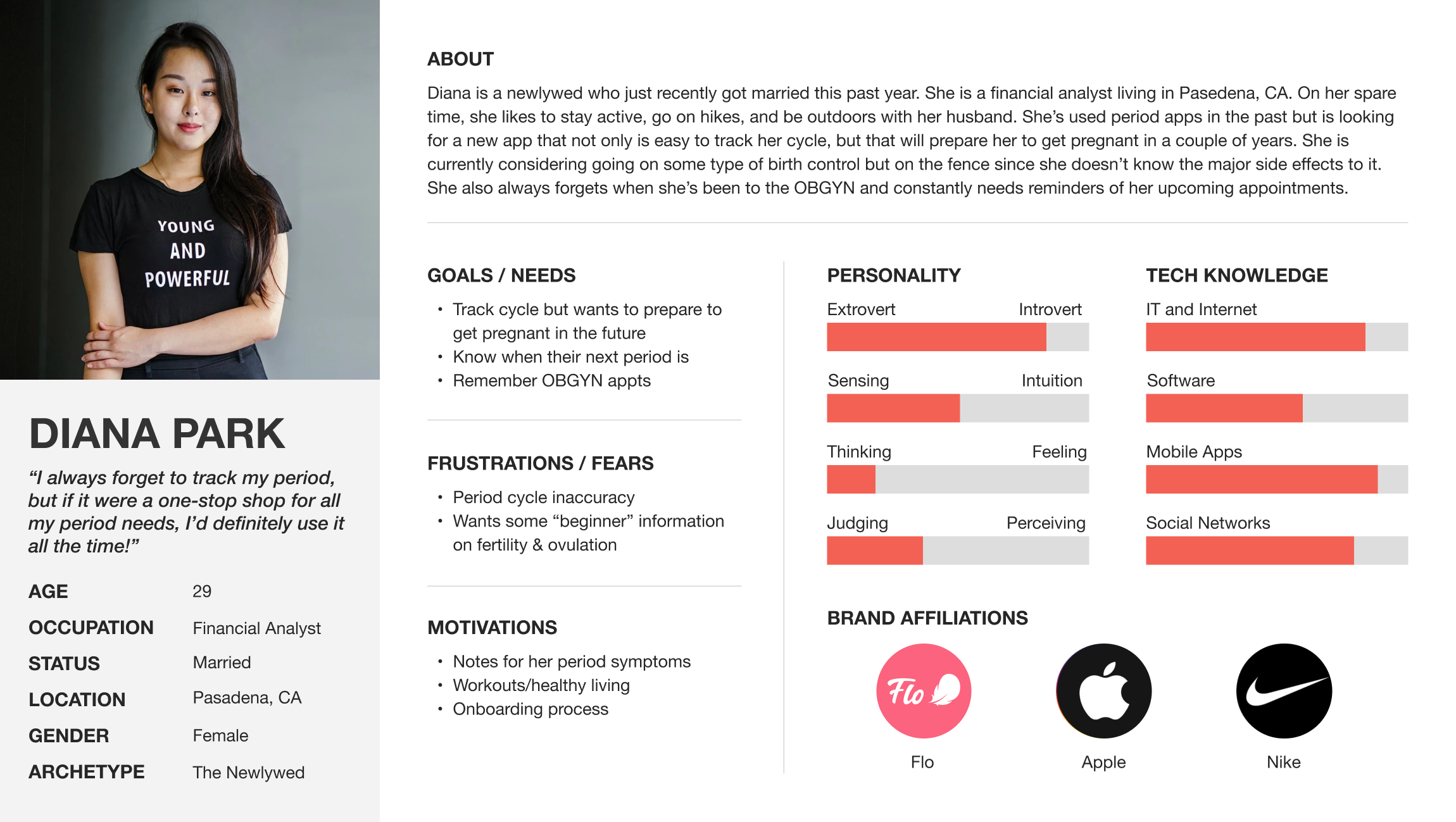
Personas
Based on user interviews and secondary research, personas were created to represent Little Red’s target audience. Having personas allowed me to communicate and empathize with what young women find necessary in a period tracker while guiding me with the decision-making throughout the project scope.
Sitemap
I created a site map of potential screens and pages for Little Red after looking at the competitive analysis and market research.
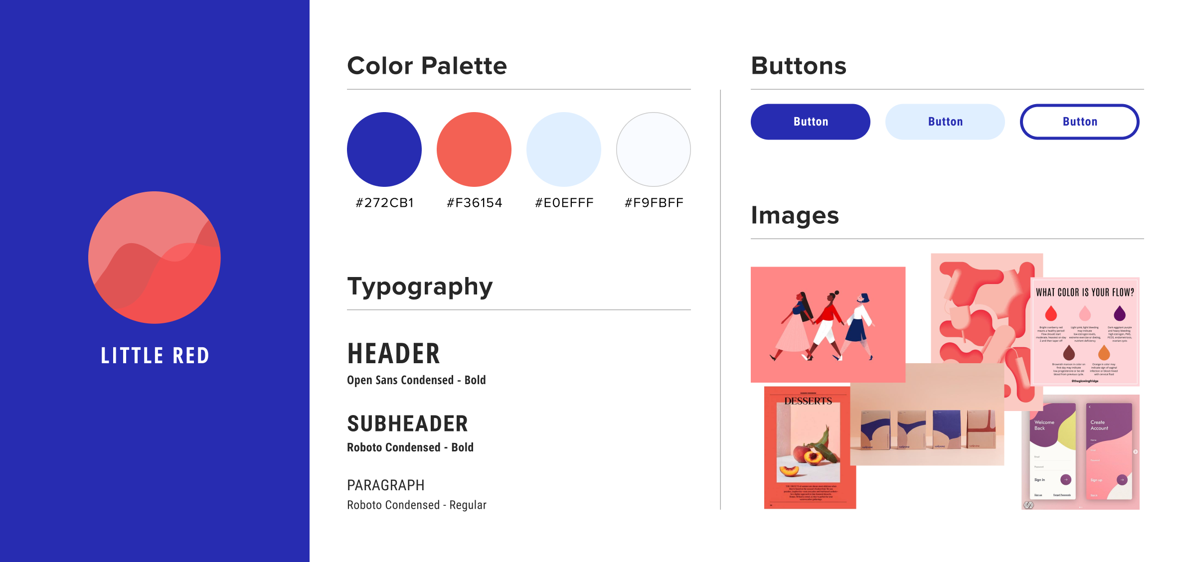
While establishing Little Red’s brand identity, I was inspired by bold and bright colors that felt playful and modern since let’s face it, periods are no fun. From there, I created sketches of a variety of logos and continued with other decisions by creating a style tile.
Design
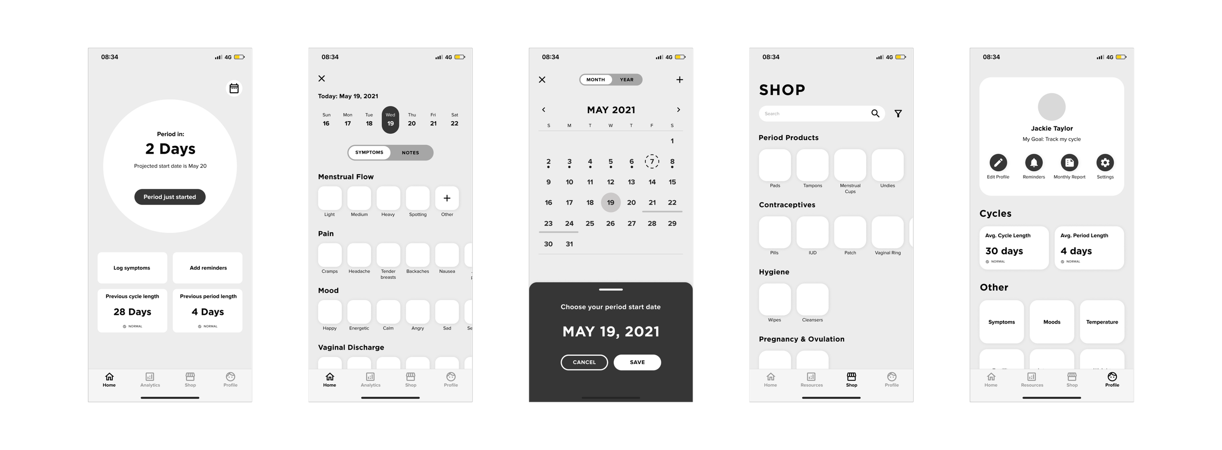
Mid-Fidelity Wireframes
Style Tile
Usability Testing
Using our mid-fidelity wireframes, I built a prototype for users to participate in usability testing and complete a task based on a specific scenario via Figma.
Overall Findings
All participants were able to complete tasks successfully
All participants found the tasks to be very easy
All participants found the app to be very organized & straightforward
All participants mentioned they loved the simplicity of the homepage had all the necessary details
All participants appreciated that there were clear icons for the log symptoms page & the shop page
Improvements
Users liked to see clear and high-quality images for the shopping section
Users wanted a way to customize their homepage so it’s catered to them & their experience
Users desired more detailed information regarding period products (i.e. contraceptives)
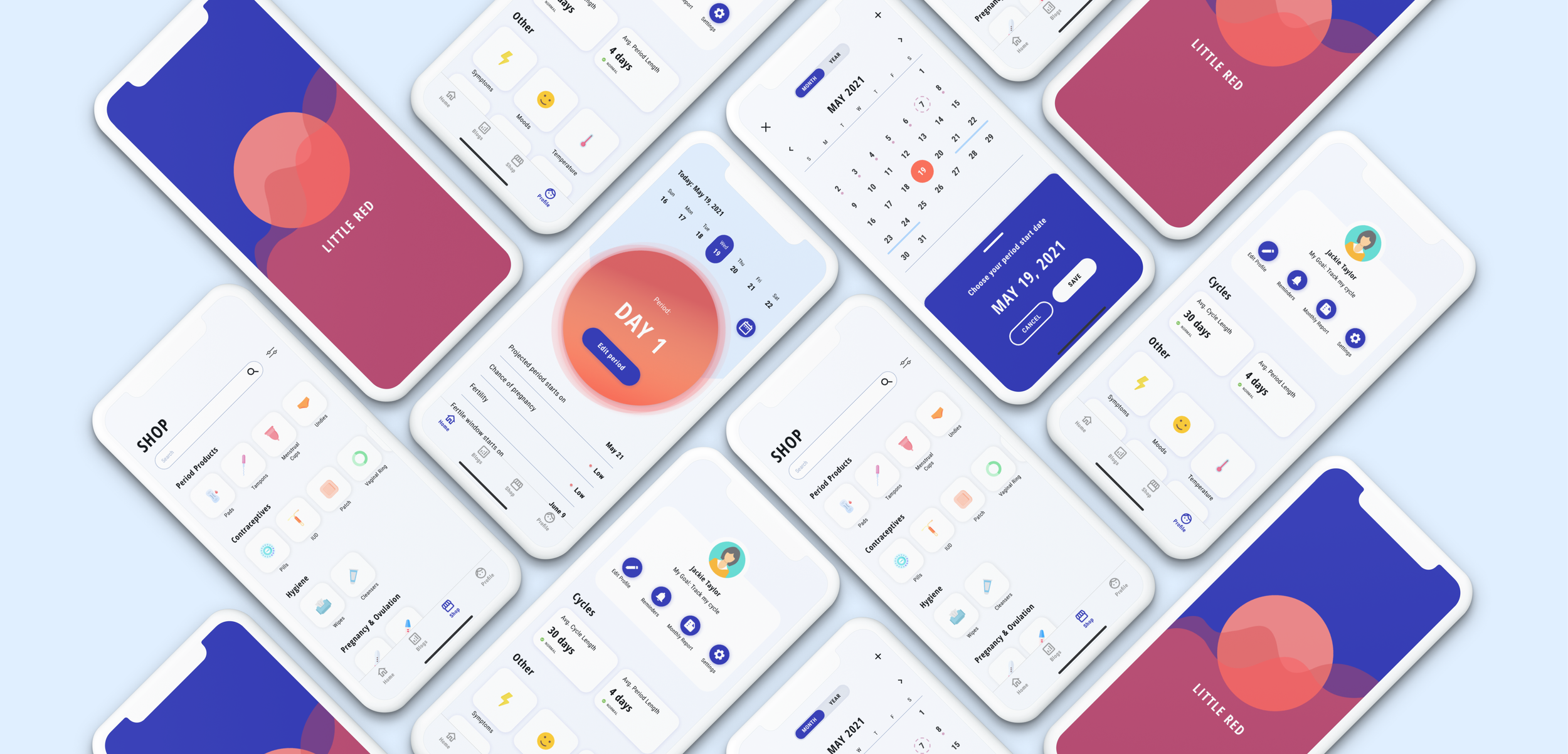
Hi-Fidelity Prototype
Conclusion
This project was exciting to build out as I quickly learned that every woman is distinctive when it comes to their period. As I was researching period tracking apps, I was shocked to see that there were not many that focused mainly on period tracking for women specifically who are not planning to get pregnant.
Overall, I learned that too much detail and complex features were not necessarily needed, and that simplicity is key to enhance user experience. My next steps would be to team up with developers within a Coding Bootcamp to potentially get the Little Red app live and functional for all young women.

