Mirror
Case Study — Responsive Web Design
Role
UX Designer
UI Designer
Branding
Duration
Jan - Feb ‘21
4 weeks
Tools
Figma
Overview
Mirror started back in 1994 as a clothing store targeting an audience looking for cheap clothing for any occasion. Their main idea was to make any type of clothing accessible to everyone. They believe clothing doesn’t have to be expensive and lasts forever, that we should be able to change styles as we need and please. Mirror was looking to redesign its logo and to build a website where customers can experience online shopping.
Goal
Design a new brand logo that is modern and simple
Design a responsive, user-friendly e-commerce website that aligns with Mirror’s brand identity and meets customer’s needs
Research Goals
01. Understand customer’s goals and motivations when shopping online.
02. Identify any challenges or frustrations for online shoppers.
03. Learn what competitors are doing in the market and find their strengths & weaknesses.
04. Identify important features for customers when online shopping.
05. Discover customer shopping patterns online.
Research Methodologies
Competitive Analysis
Researched and compared various brands that were similar to Mirror to gain perspective of the competitive market.
User Interviews
Conducted user interviews to empathize and provide an in-depth understanding of the users’ values, perceptions, and experiences.
Findings
Goals: Users wanted an organized category and navigation system. They also wanted to find affordable clothing with a variety of styles while avoiding issues with shipping and returns.
Needs: Users need well-fitted clothing and large high-quality product images to see the material of the clothing. They also need similar looks and customer reviews.
Frustrations: Most users expressed their frustrations with delays in shipping and inconsistent sizing. Users also disliked spam emails when creating logins.
Motivations: Users were motivated by promotions and discounts, free & seamless shipping process, and easy returns.
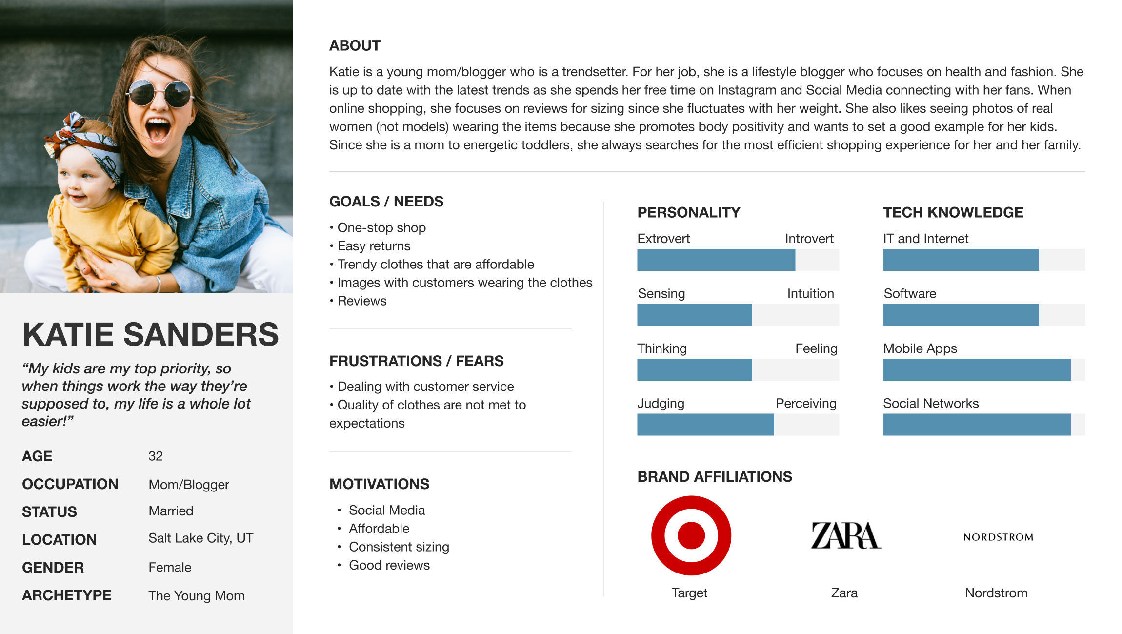
Personas
Based on user interviews and market research, personas were created to represent Mirror’s target audience. Having personas allowed me to communicate and empathize with the customer’s needs while guiding me with the decision-making throughout the project scope.
Information Architecture
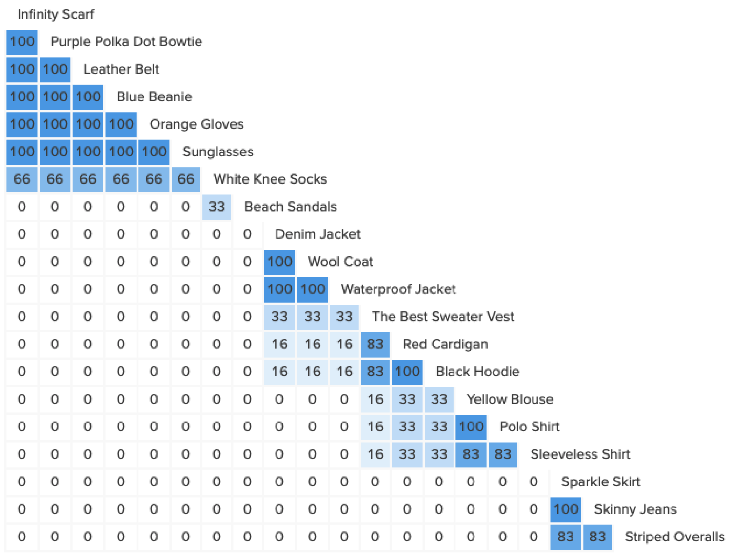
Card Sorting
To determine the organization of content on the Mirror website, I conducted an open card sorting activity through an online tool called Optimal Workshop. I conducted a card sort with 6 participants with ages ranging from 25-30.
Sitemap
After defining site categories based on results from our card sorting, I created a site map to show proposed screen pages and user flows.
Flows
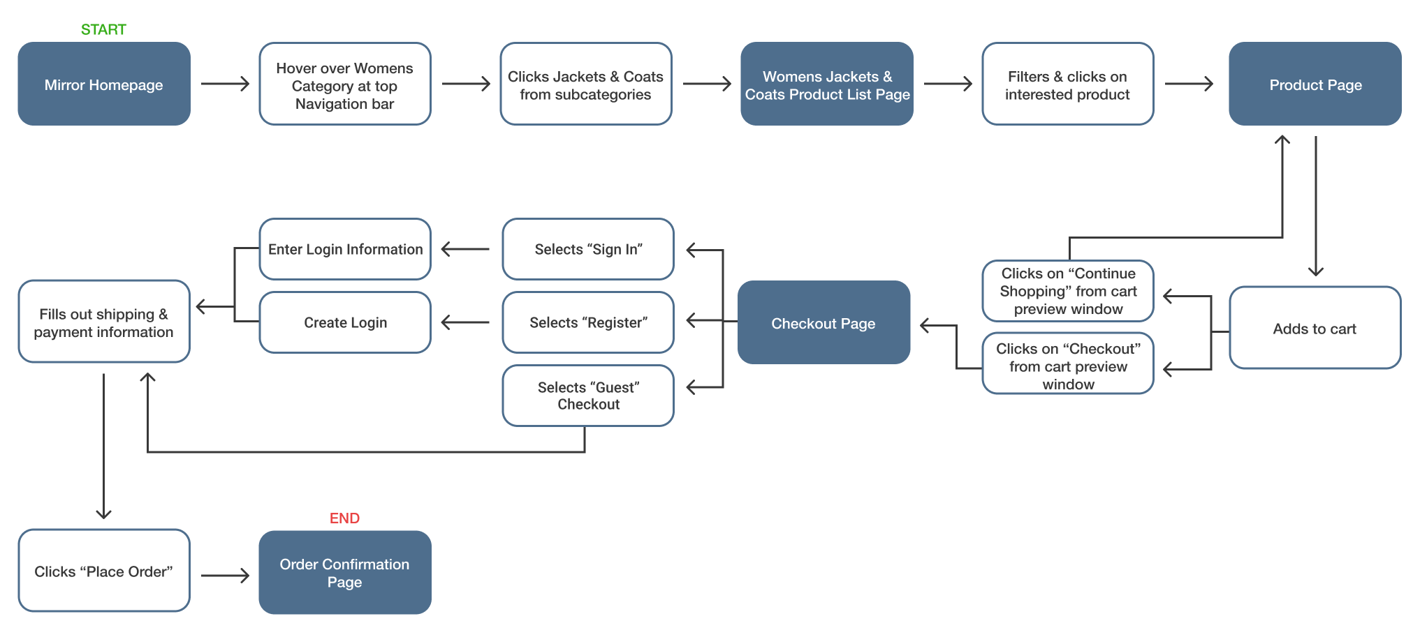
Task Flow
Before designing wireframes, I identified the main flow where the user would complete a task through individual steps.
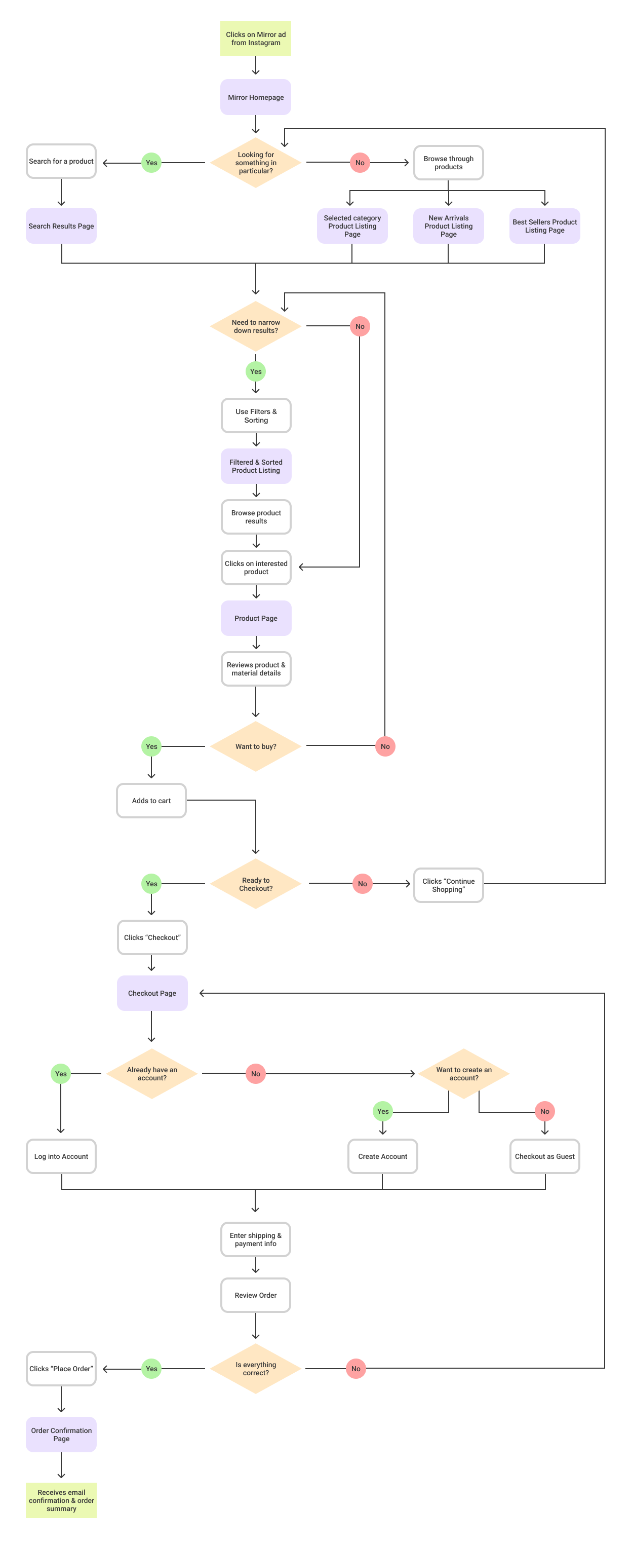
User Flow
Afterward, I went further and mapped a user flow experience in a more complex scenario. I identified all of the different paths a user would take to complete each task.
Design
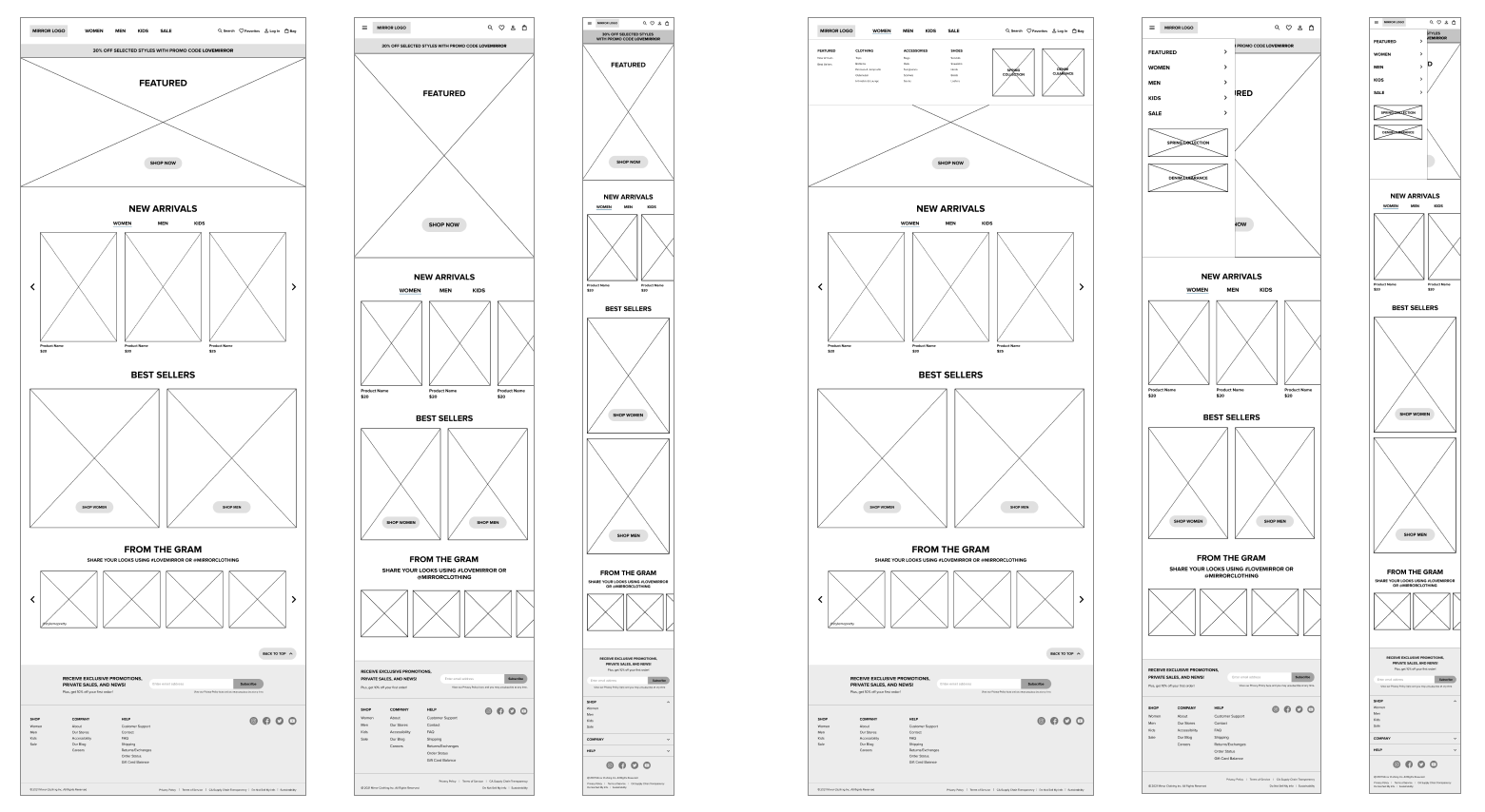
After forming research findings, personas, and IA, I began brainstorming website layout ideas through sketches. This led to generating wireframes and responsive wireframes for different pages.
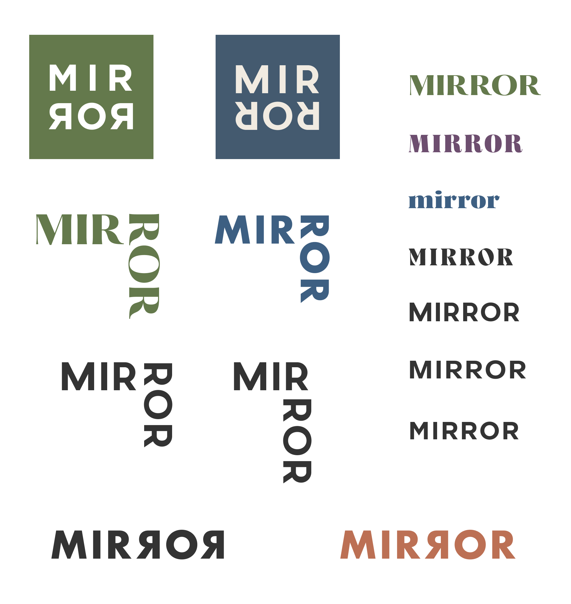
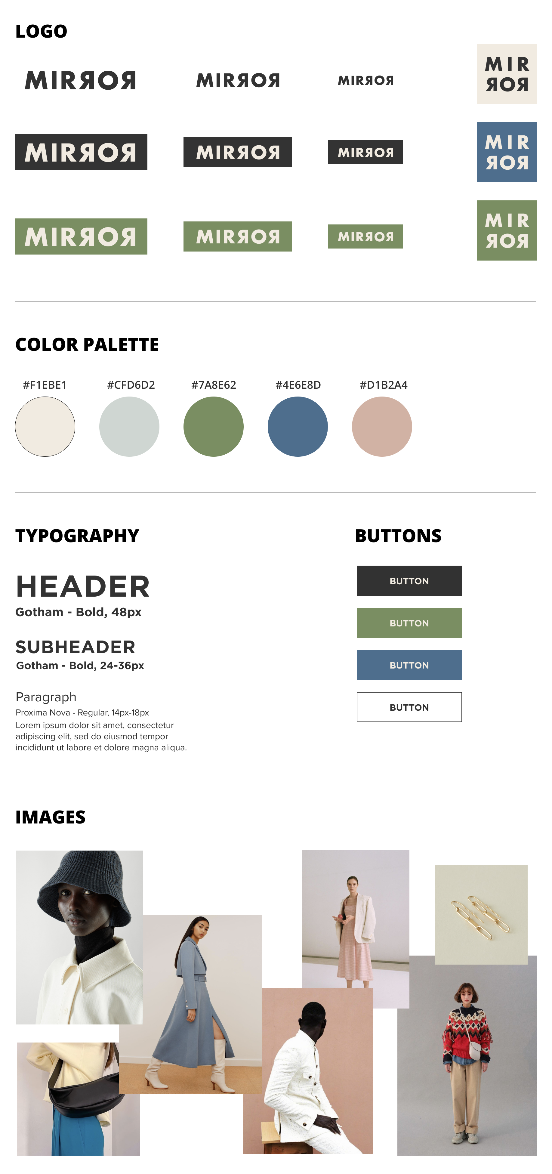
While establishing Mirror’s brand identity, I was inspired by neutral pastel colors that felt clean, modern and calming, which were tied together through a mood board. From there, I created sketches of a variety of logos and continued with other decisions by creating a style tile.
Sketches
Lo-Fi Responsive Wireframes
Logo Iterations
Style Tile
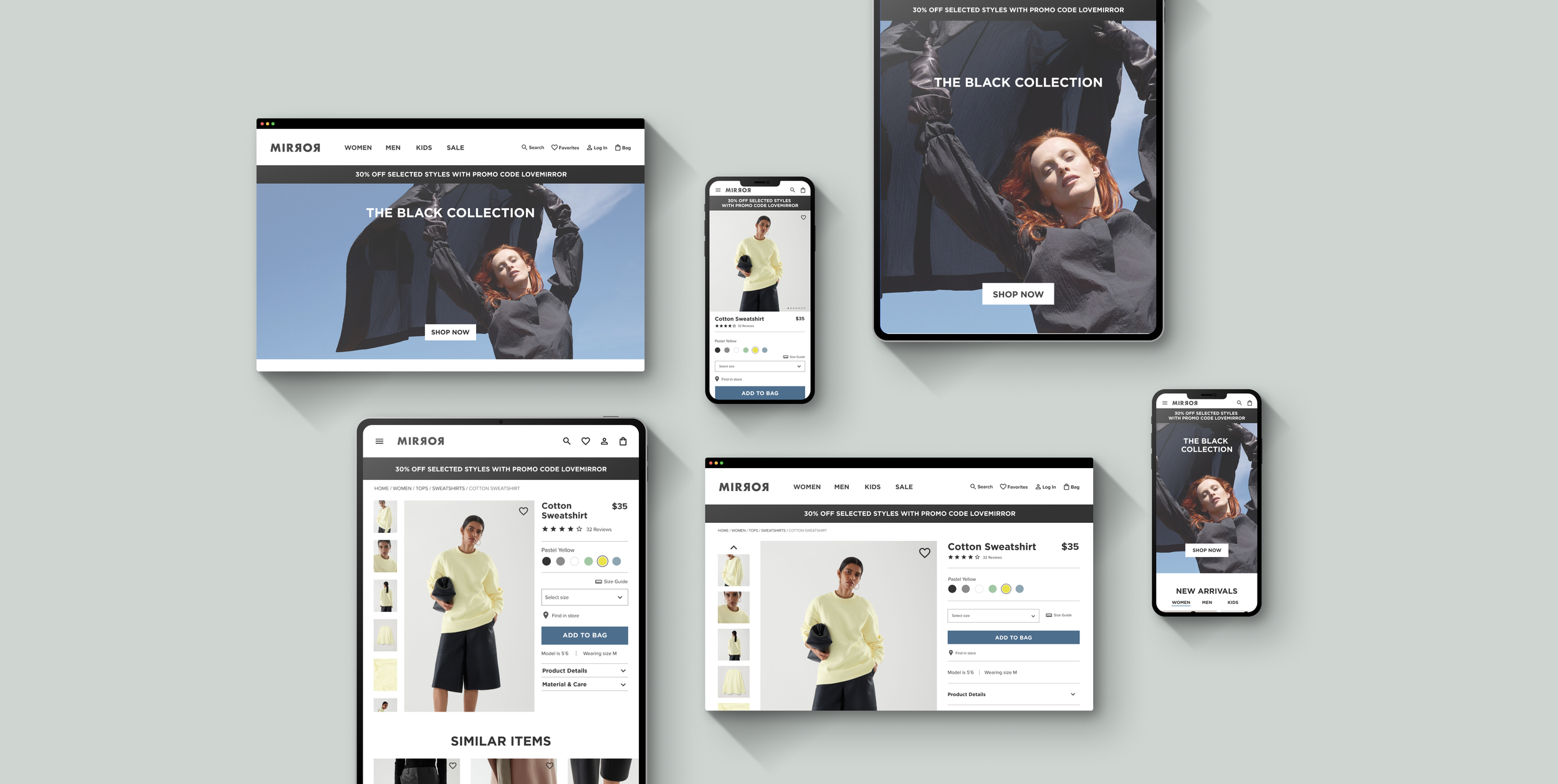
Responsive UI Designs
Usability Testing
Using our high-fidelity wireframes, I built a prototype for users to participate in usability testing and complete a task based on a specific scenario via Figma.
Overall Findings
All participants were able to complete tasks successfully
All participants found the task to be very easy and seamless
All participants found the Mirror website to be aesthetically clean and minimal
Key Takeaways
Users rely on the navigation bar as part of their shopping process
Users like short pages with collapsable details
By adding a shipping progress bar, users are motivated to shop for more items to receive free shipping
Users focus on reviews & ratings before purchasing a product
Users want to be inspired by real customers from their social media posts
Users enjoy seeing more items on a product listing page
Improvements
Have the option to view how many items per page
Have the option to filter by review type
Include a “Shop the Look” or “Complete the Look” carousel feature on product page
Next Steps
Revisions
Make Iterations based on usability testing findings.
Test
Refine prototype and test again.
Hand Off
Meet with developers to get an idea of project timeline to get site live.


